Context
Jan. 2021, Torilo Academy wants to grow it’s student number, increase its course fees and expand its courses to focus primarily on in-demand technology skill.
The Problem
It’s current website and identity do not match it’s projections and lack clear communication. It has also failed to convert up to 10% of its website visitors.
The Objective
Research and develop a responsive website to help students access best training information with a focus on increasing conversion by 30%.
My Role
As the Head of Design, my responsibility was to guide the team and lead research and design initiatives to meet the business goal.
research
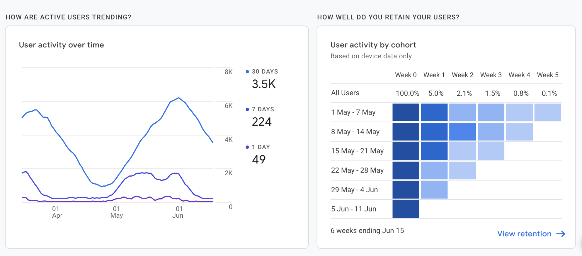
For this, we leverage primary data sources from user activity monitoring on the website. We dug deeper into insights from data of past students’ registration, the website google analytics and internal survey to understand the root cause.
Key Insights
- We identified through data insights from Google Analytics that more than 30% of website visitors do not view the full information on the course page.
- About 45% of visitors do not reach the registrations page.
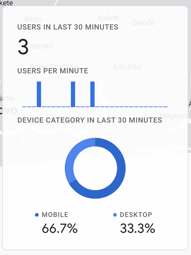
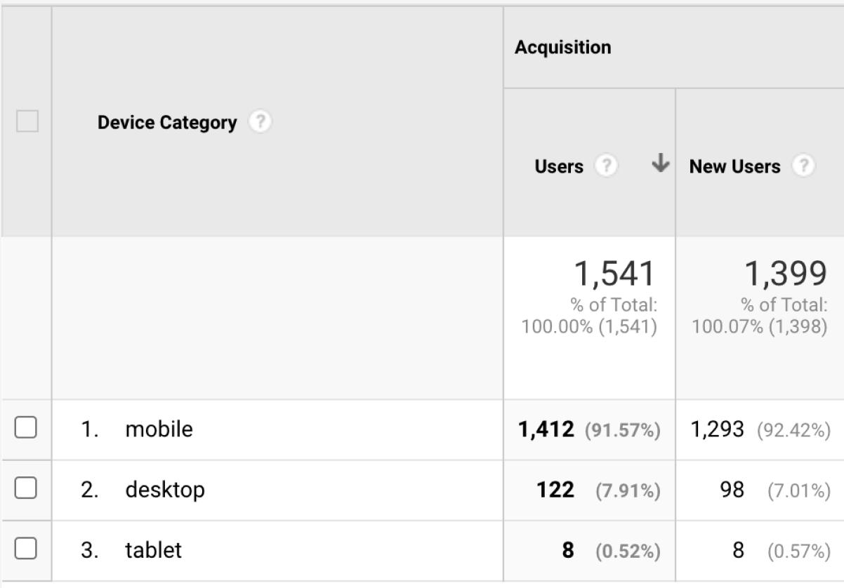
- Over 70% of visitors viewed the website from a mobile device
- 1 of 5 students asked for social proof via website live chat and social media channels
We proceeded with further review of the website which revealed that:
Website Audit
The landing page had a poor layout, this flaw in its information achitecture would make it difficult for visitors to find information easily.
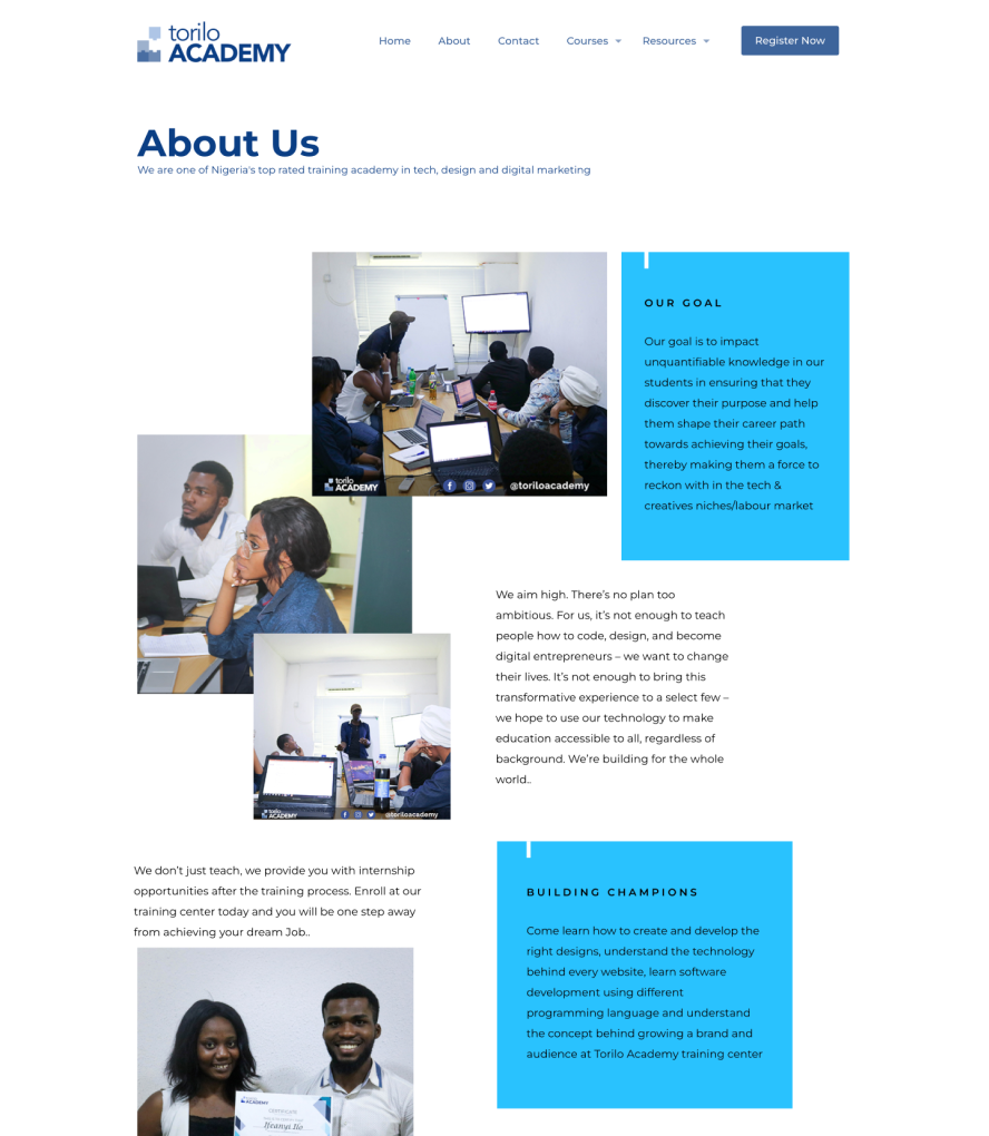
About Us page had a large amount of information which weren’t an important influencer in the decision making for the visitors.
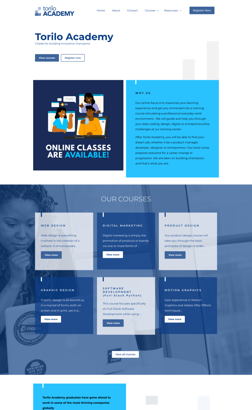
- The previous home and about us page.
Website Audit
The landing page had a poor layout, this flaw in its information achitecture would make it
difficult for visitors to find information easily.

About Us page had a large amount of information which weren’t an important influencer in the decision making for the visitors.

The course pages do not quickly help the visitor understand what to focus on first due to its clustered layout. They also do no emphasize on the learning outcomes.
The testimonials/social proof were placed at the bottom of the page next to the footer - a section the visitor might most likely not find or miss it because it wasn’t designed to capture attention.
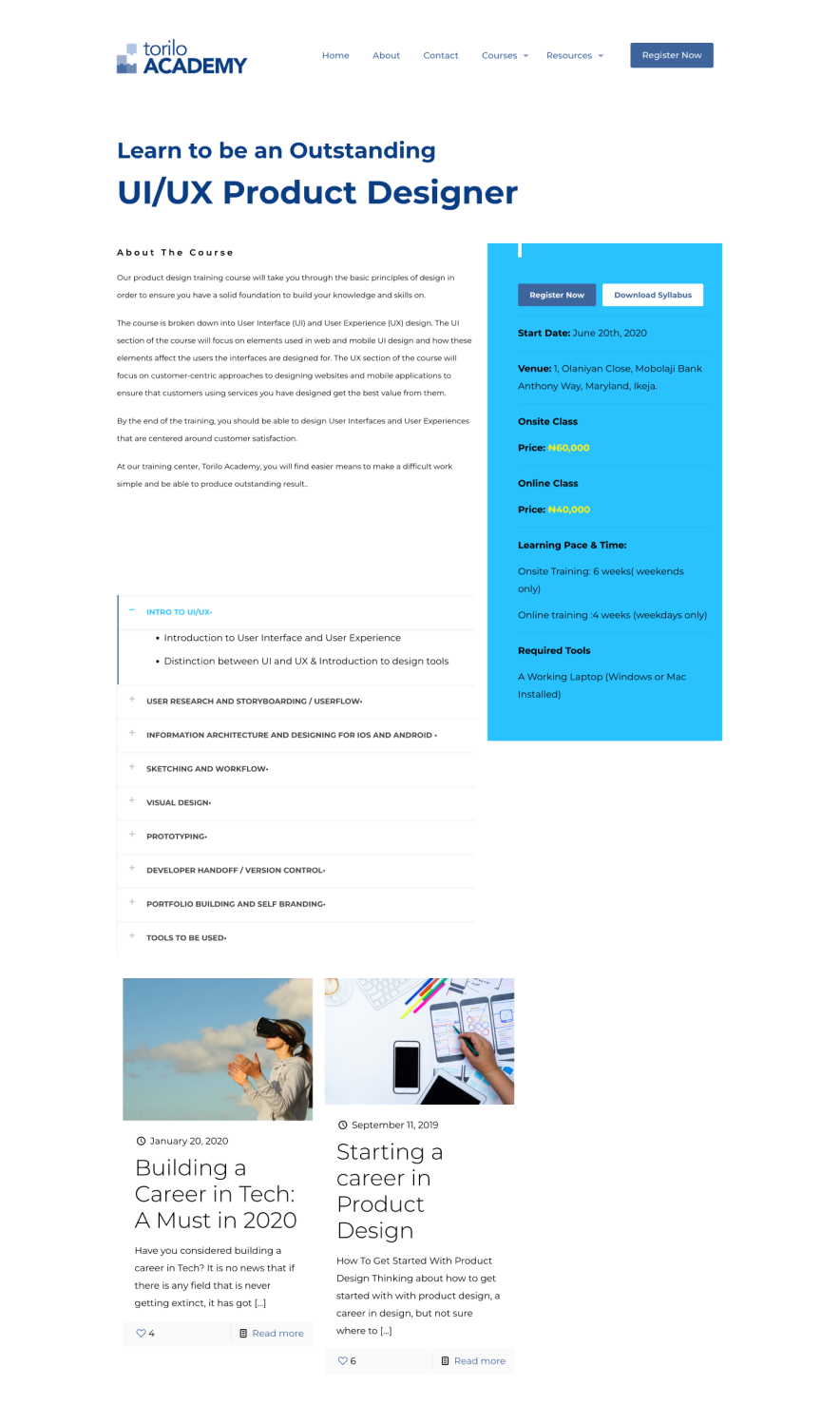
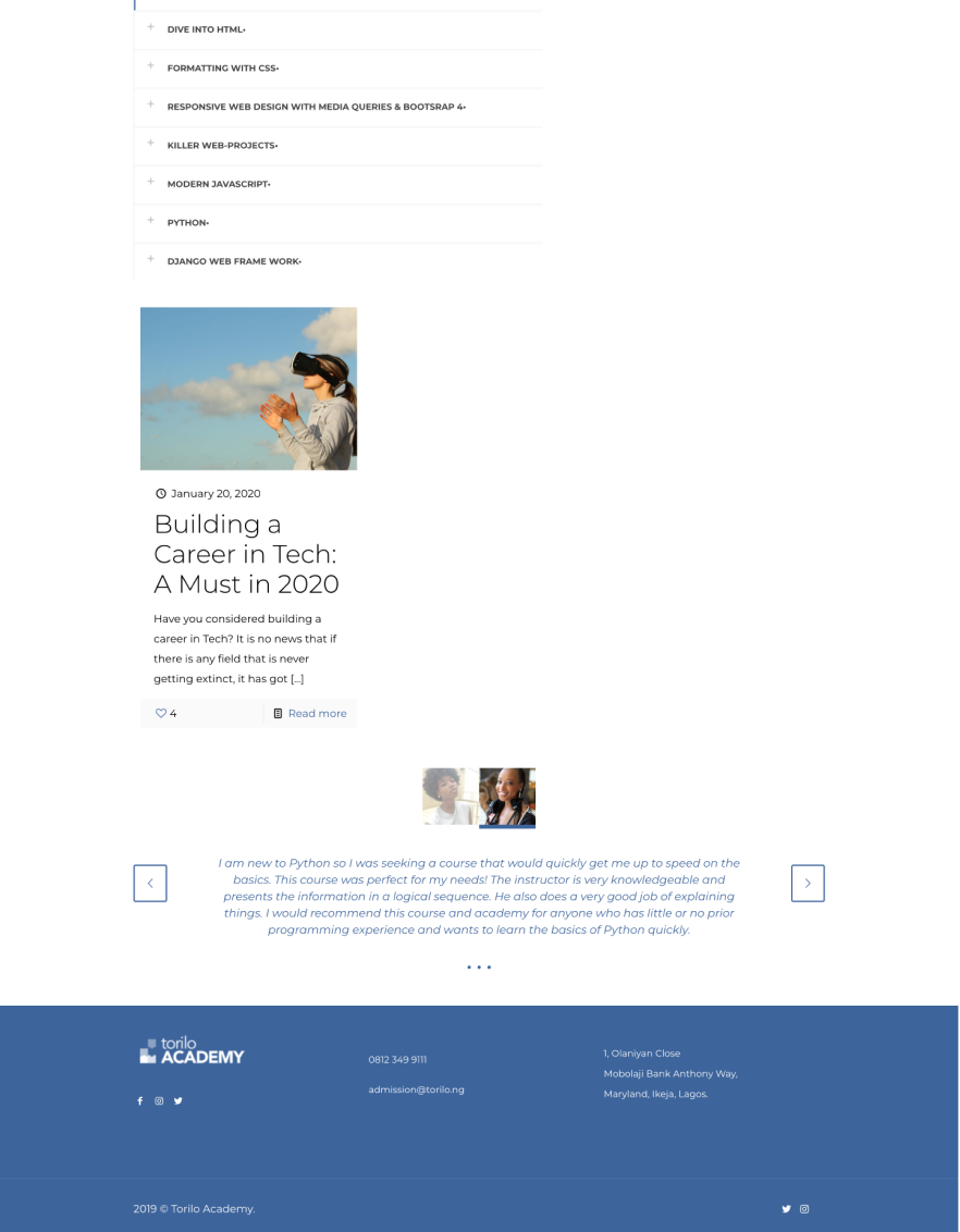
- The course and testimonial page
The course pages do not quickly help the visitor understand what to focus on first due to its clustered layout. They also do no emphasize on the learning outcomes.

The testimonials/social proof were placed at the bottom of the page next to the footer - a section the visitor might most likely not find or miss it because it wasn’t designed to capture attention.

Conceptualise
We needed to draw up some set of assumptions to help us better understand the problem. We leveraged on the following guiding questions which we adopted within the team:
What is the user trying to accomplish?
Register for a course training
What is important to the user and what will give them confidence to continue?
The course curriculum, cost of training, mode of training (onsite, hybrid or virtual) duration and the perceived value/return on investment of the training
What additional information will the user need to accomplish the task?
Payment structure
What are the user’s hesitations or barriers to accomplishing the task?
Poor mobile responsiveness, lack of conviction or perceived benefit
Customer Journey Map
We designed a journey map to helps us better understand the typical journey a visitor/prospective student would take to register for a course.
Product
Awareness
Chat support
(Instagram & Twitter)
Visit website
Review course
curriculum and
testimonial
Inspect academy
(onsite students)
Register for
course
Make Payment
Product
Awareness
Chat support
(Instagram & Twitter)
Review course curriculum and testimonial
Inspect academy (onsite students)
course
We relied on these facts to propose a redesign and focused on the following:
- Clear course description with pricing
- Course outline
- Success stories
- Clear Call-To-Actions
Website Redesign (Mobile first)
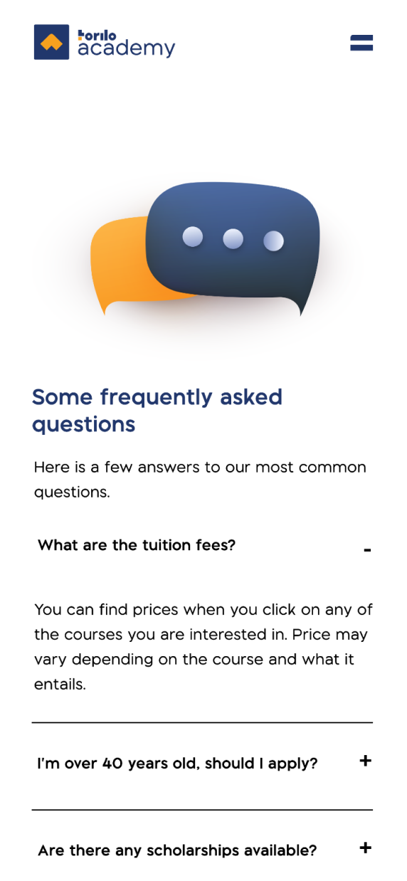
Focus was placed on creating a mobile first approach to cater for the majority of the visitors identified in the research. Relevant information were prioritised to work with size constraints. The Frequently Asked Questions (FAQ) page was designed to enable visitors get quick answers to the common questions.
To aid easy navigation, we focused on eliminatiing redundant information; the about us page was eliminated and some parts of the contents were distributed across other pages. This also applied to the desktop versions of the website.
Focus was placed on creating a mobile first approach to cater for the majority of the visitors identified in the research. Relevant information were prioritised to work with size constraints. The Frequently Asked Questions (FAQ) page was designed to enable visitors get quick answers to the common questions.
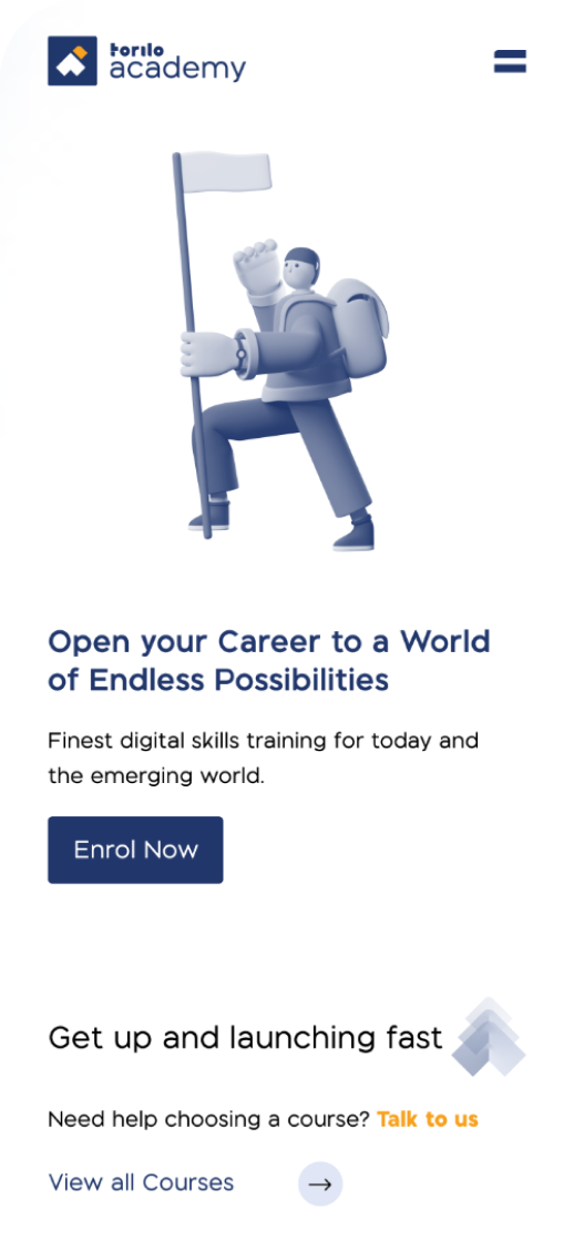
To aid easy navigation, we focused on eliminatiing redundant information; the about us page was eliminated and some parts of the contents were distributed across other pages. This also applied to the desktop versions of the website.


- The course and testimonial page
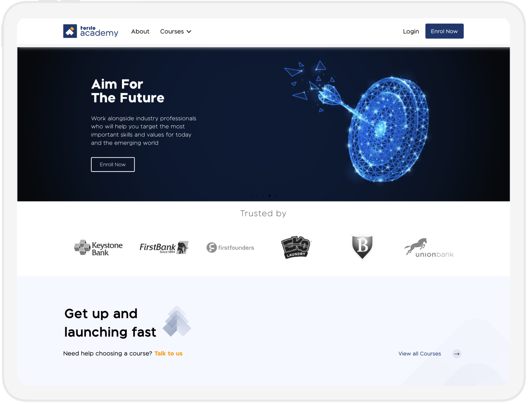
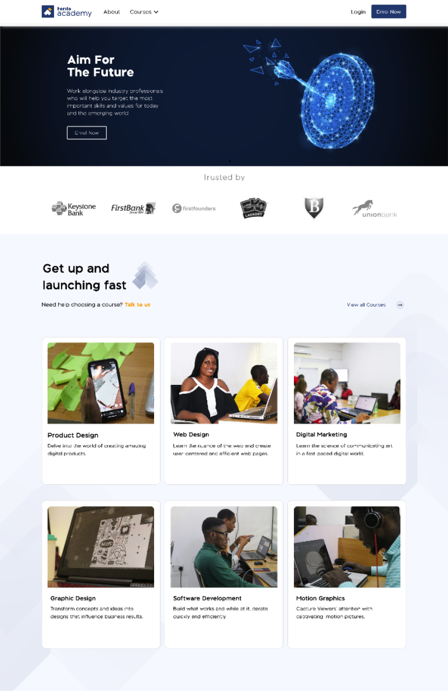
The landing page was redesigned to show social proof at first glance (past clients). Courses tabs were also redesigned to improve readability and create a more responsive design.
The visitors final goal is to get a job or start earning with the skill after training, We showcased how we can help with this through our partnership with a job community and our students’ success stories.
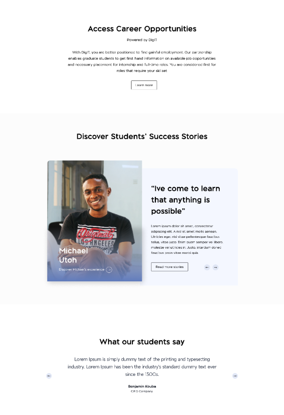
- Redesigned landing, FAQ and course pages (Mobile view)
The landing page was redesigned to show social proof at first glance (past clients). Courses tabs were also redesigned to improve readability and create a more responsive design.

The visitors final goal is to get a job or start earning with the skill after training, We showcased how we can help with this through our partnership with a job community and our students’ success stories.

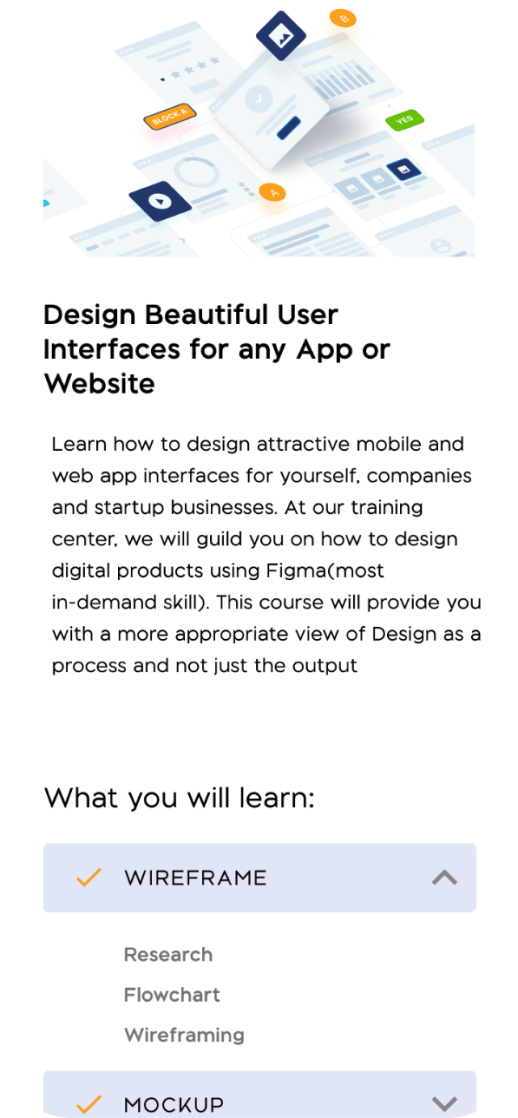
The course page information was restructured to clearly state the learning outcomes, easily learn about the mode of learning and the cost. We prioritised these primary information and moved the extensive description to a sticky card to allow the visitor get a glance while scrolling through.
Breaking down the course contents would enable the visitor scan easily. An accordion was used to nest the multiple information for the course content and a direct link to download the course syllabus for more deeper insights into the curriculum.
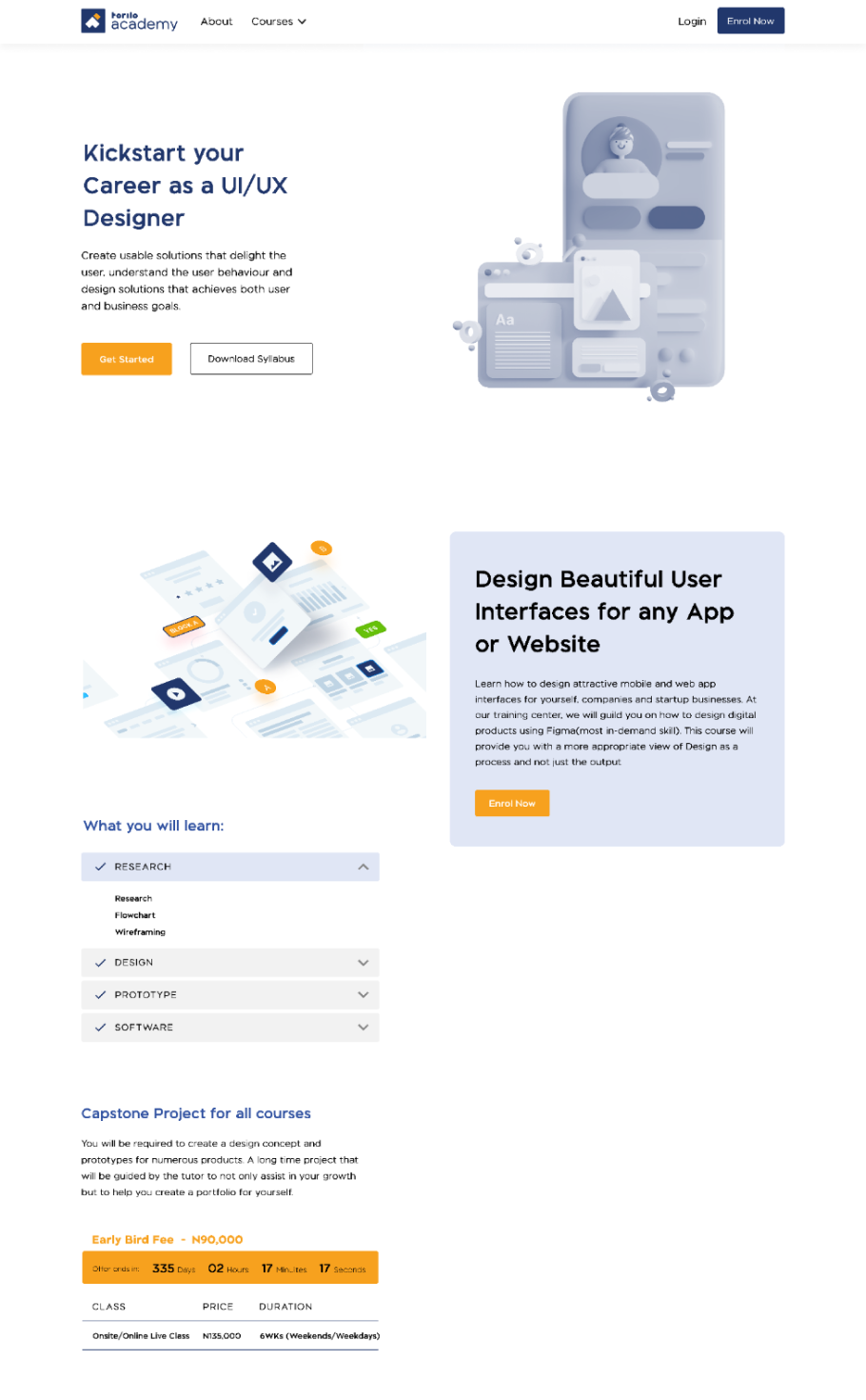
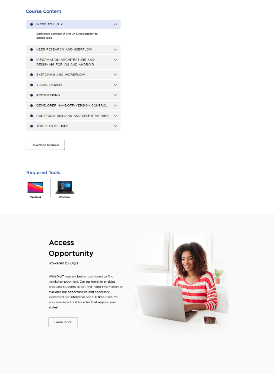
- Redesigned (UI/UX Design) course page
The course page information was restructured to clearly state the learning outcomes, easily learn about the mode of learning and the cost. We prioritised these primary information and moved the extensive description to a sticky card to allow the visitor get a glance while scrolling through.

Breaking down the course contents would enable the visitor scan easily. An accordion was used to nest the multiple information for the course content and a direct link to download the course syllabus for more deeper insights into the curriculum.

Registration Page
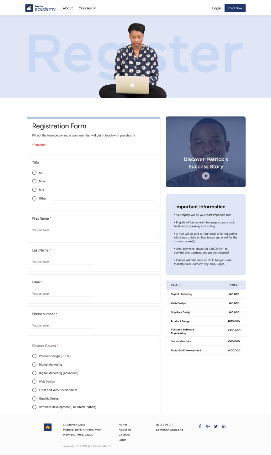
A success story was also included at the registration page to further reduce hesitation to proceed with registration.
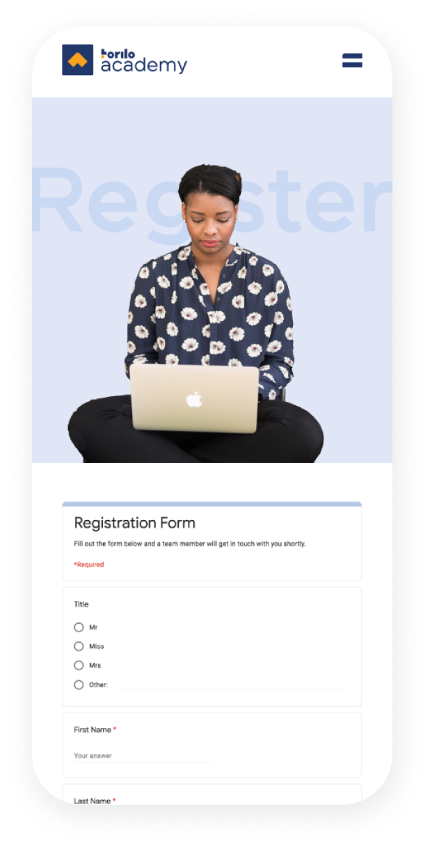
A success story was also included at the registration page to further reduce hesitation to proceed with registration.


Results
45%
increased registration
52%
increased revenue
